For most of my career, I’ve been surrounded by data.
Sometimes I’ve been the one consuming it, sometimes the one producing it, and often the one standing in the middle, trying to turn large amounts of information into something that actually helps people make better decisions.
Over time, I’ve become convinced that data on its own is rarely enough. What really matters is the story you tell with it.
That belief hasn’t come from a textbook or a single role. It has been shaped by a series of very different experiences, each of which forced me to think carefully about how information is interpreted, how decisions are made, and how easily even smart people can misunderstand complex ideas if they are not presented in the right way.
I want to share some of those experiences, along with a few concepts from research that have strongly influenced how I think about data storytelling today.
My aim is not to provide a rigid framework or a set of rules, but to explain how I’ve learned to combine data, narrative, and an understanding of human behaviour to create stories that actually lead to action.

Learning to be concise as an equity analyst
I started my career as an equity analyst in asset management. In that world, your job is to understand companies, industries, and markets, using only public information, and then persuade someone else to make a decision based on your analysis.
Typically, that “someone else” is a fund manager.
What I learned very quickly is that you may spend weeks analyzing a company, but you often get only a minute or less to explain why it’s a good or bad investment.
There’s a simple rule of thumb in that environment: if you can’t explain a good investment idea in under a minute, using very simple language, it’s probably not a very good investment idea.
That idea stayed with me. It forces clarity. If you can’t explain something simply, either you don’t understand it well enough, or the idea itself isn’t strong.
There’s nowhere to hide behind complexity. You have to distill your thinking down to the essence of what matters.
That discipline of simplicity and conciseness has followed me throughout my career, even as the context around me has changed dramatically.
From public information to strategic complexity
After asset management, I moved into a group strategy role at Swiss Re.
The shift was significant. Instead of working only with public information, I suddenly had access to a vast amount of internal data. The questions were bigger, the time horizons longer, and the stakes often much higher.
Strategic work involves fundamental decisions that can shape a company’s direction over the medium to long term. It also involves extensive stakeholder engagement.
You’re not just analyzing information; you’re building consensus across different parts of the organization, often over long periods of time.
In that environment, storytelling becomes even more important. You’re dealing with complex issues, but you still need to guide people toward a shared understanding and a clear decision.
The challenge is not a lack of data. It’s deciding what matters, what doesn’t, and how to bring people along with you.
More recently, I moved into FP&A, where the nature of the data changed again. The information is much more granular, and the focus is often on nearer-term decisions.
The goal is to work closely with business leaders and help them make better commercial decisions using that data.
Looking back, these different roles have given me very different perspectives, but they’ve all reinforced the same core lesson: data only becomes powerful when it’s translated into a story that people can understand and act on.
Why cognitive biases matter more than we think
Before you finalize a presentation or shape a narrative, there are two things I believe you need to think about very carefully. The first is cognitive bias.
There are well over a hundred identified cognitive biases. I certainly don’t know all of them, and I struggle to distinguish between some of them myself.
But it’s incredibly important to be aware that they exist, both in yourself and in the people you’re presenting to.
As analysts and finance professionals, we like to think we are rational. But the reality is that the way we acquire information, evaluate it, and make decisions is heavily influenced by biases.
Many of these biases fall into two broad categories that are particularly relevant for data storytelling: how we acquire information, and how we evaluate it and make choices.
One example is the ostrich effect, where we tend to disregard negative information more readily than positive information.
There’s even research suggesting that ignoring information can trigger a dopamine response, because it makes us feel clever for dismissing something. I recognize that feeling myself.
Another extremely important bias is the framing effect. The way information is presented has a huge impact on how it’s received.
A classic example is a cleaning product that “kills 95% of bacteria” versus one that “lets 5% survive.” They describe the same outcome, but one sells far better than the other.
Then there are verification biases, such as confirmation bias, where we favour information that confirms what we already believe.
There’s also what’s known as the self-relating bias, where people remember information better if it feels personally relevant to them.
One bias I find particularly interesting is the illusion of explanatory depth. It’s the tendency for people to believe they understand complex phenomena much more deeply than they actually do.
This becomes very important when you’re presenting complex data. People may think they understand what they’re seeing, but their understanding is often far shallower than they realise.
Finally, there are simplification biases. We simplify complex environments, see causality where there may only be correlation, and become overconfident in our judgments.
Visual choices, such as how you scale a chart, can dramatically influence how volatile or significant something appears.
All of this means that as users and presenters of information, we have to be extremely careful. We are not neutral conduits of truth. The way we select, analyze, and present data inevitably shapes the decisions that follow.

FP&A at the centre of complexity
One day, when my son was home sick from school, he chose a small green alien character for one of my slides. That character ended up representing FP&A in my mind.
FP&A sits at the centre of a very complex world, surrounded by vast amounts of data, and our job is to translate that complexity into something executives can actually use. The most effective way people make decisions is through simple, relevant narratives.
To do that, FP&A professionals have to understand the business deeply. We’re not just reporting results or explaining variances. We are taking on part of the decision-making burden.
There’s a chemical called glutamate that builds up in the brain as we make decisions, and it contributes to mental fatigue. Executives make an enormous number of decisions every day.
One of our responsibilities is to reduce that burden by doing the heavy lifting ourselves, filtering the noise, and presenting only what truly matters.
How people actually read information
Eye-tracking research shows something that shouldn’t surprise us, but often gets ignored. People don’t read information carefully from top to bottom. They skim.
They focus on headings, the beginnings of sentences, and images. As they move down a page, their attention drops off quickly.
This has big implications for how we write slides, reports, and narratives. If the key point is buried at the end of a long sentence, there’s a good chance it will be missed.
Clear headings, short sentences, and upfront statements matter far more than we like to admit.
Our concentration spans are short. We need to accept that and design our communication accordingly.

Knowing your audience
The second thing you need to think about early is your audience. In most organizations, your audience will usually fall into one of three broad groups: experts, managers, or executives.
With experts, you can go lighter on narrative and heavier on data. It’s often an exploratory conversation. With executives, you need to get straight to the point. Managers typically sit somewhere in between.
In my experience, especially in large organizations with long decision processes, it often makes sense to start by creating material that would work for experts.
That helps you understand the data yourself. You get feedback, refine your thinking, and identify what really matters.
As you move toward managers, you slim things down. By the time you reach executives, only the most important information should remain. Every step is about removing noise, not adding content.
Understanding your audience also means understanding their pain points, goals, and interests. This is where cognitive biases come back into play. If you know what someone cares about, you can frame information in a way that resonates with them.
I’ve found it very helpful to use senior management engagement not just to understand their own views, but to understand the wider decision-making landscape.
Senior leaders often know the preferences, concerns, and biases of other key stakeholders far better than you do. That insight can be invaluable.
Purpose comes before content
Before building any story, you also need to be clear on the purpose of your presentation. Are you trying to motivate, activate, persuade, or align?
If the goal is motivation, the story will be more emotional and personal, and less data heavy. If the goal is activation or persuasion, you need a clear problem statement at the start, a solution at the end, and evidence along the way.
Whatever the purpose, the message must be aligned with the needs of the audience. That alignment is what turns information into action.
Data, narrative, and delivery
For me, data storytelling rests on three components: data, narrative, and delivery.
Data is the backbone, but it’s not just about having information. It’s about selecting the most important data and analyzing it in a way that’s relevant to the people you’re speaking to.
Narrative is about structure. I was initially sceptical of storytelling models that talk about characters, settings, conflicts, and resolutions. They sounded more like fiction than business. But over time, I realised how applicable they are.
In my presentations, I often start with the “characters.” That might be a client group, a competitor, or a product line. I explain who they are, where they come from, and why they matter. Then I move to the setting, providing context. Why is this relevant? How material is it?
From there, I explain the conflict or opportunity, making it personally relevant to the decision-maker. If they can see how it affects them, their performance, or how they are perceived, it becomes much more powerful.
Delivery is about simplicity, clarity, and logic. I spend a lot of time thinking about the order of slides, the flow of the argument, and the most logical way to take someone through the story.
One thing I firmly believe is that when presenting to executives, you don’t get marks for showing your workings. This isn’t school. The only thing that matters is the outcome. Showing too much analysis often distracts rather than helps.
Visualization as a means, not an end
When it comes to visualization, the key question is simple: does it help understanding? Too often, visuals are used because they look impressive, not because they add clarity.
A good visual does the work for the audience. It shows the insight directly. It doesn’t require them to calculate ratios or infer conclusions. It is explicit, intuitive, and honest.
Never imply something and expect people to figure it out. Use the data yourself and show the result.
Medium matters, but culture matters more
A final point that often comes up is the medium of communication. In my experience, PowerPoint remains the dominant tool, especially at senior levels. Many executives prefer something familiar, sometimes even a physical printout.
That doesn’t mean digital tools have no place. Dashboards and BI platforms are extremely valuable for exploration and standardised reporting.
But when it comes to storytelling and decision-making at the top, a small number of carefully crafted slides is still incredibly effective.
Ultimately, you have to adapt to your organization’s culture. Over time, you can influence change, but you can’t ignore how people prefer to consume information today.
Why this all matters
Data storytelling is powerful. It shapes decisions. It influences outcomes. But it only works if you are aware of your own biases, understand your audience, and use data and visuals in a way that genuinely enhances understanding.
If you get it right, you don’t just present information. You help people make better decisions. And in the end, that’s what finance, FP&A, and analytics should really be about.
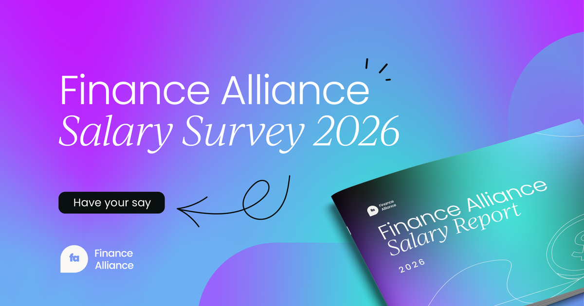
Participate in our Salary Survey to add your insights to a global report your peers are already taking part in. Don't let your voice be ignored.


Finance alliance insider
Thank you for subscribing
Level up your finance alliance career & network with finance alliance experts.
An email has been successfully sent to confirm your subscription.
 Follow us on LinkedIn