Using visual aids like financial charts and graphs can simplify complex data and make it more accessible. 📊
But with so many types of visuals available, it can be difficult to know which is the best fit for your needs.
Below, we've compiled some of the most commonly used graphs and visuals in finance (along with some financial visualization examples of each) to help you select the right option.👇🏼
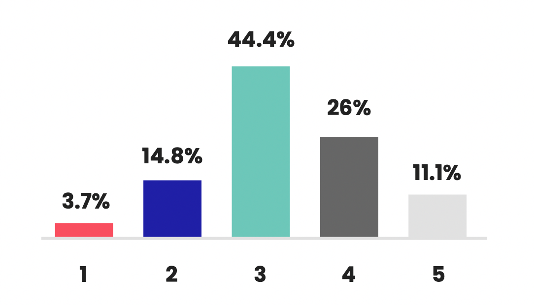
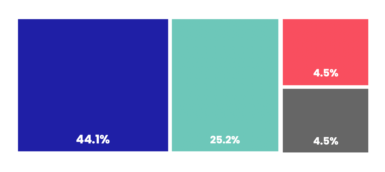
1. Bar chart
A bar chart compares values across categories using rectangular bars, where bar length or height represents the value.
Common finance use cases:
- Comparing quarterly revenue by business unit or product category
- Showing operating expenses by department or cost center
- Visualizing budget vs. actual variance with grouped bars
- Ranking financial KPIs like gross margin by region
Best practices for finance-ready bar charts:
- Sort bars (highest to lowest) when ranking matters
- Use consistent color meaning; neutral for actuals, accent colors for variances
- Label units clearly ($, %, basis points) and include data labels when precision counts
- Keep categories manageable (10 or fewer) or group smaller ones into "Other"
- Always use a zero baseline to avoid misleading comparisons
Common mistakes to avoid:
- Too many categories (makes insights disappear)
- Truncated axes that exaggerate differences
- Random colors without meaning
- Mixing time trends with category comparisons
Best for: Category comparisons, budget breakdowns, variance highlights, KPI rankings.
Avoid when: You need to show trends over time; use a line chart instead.
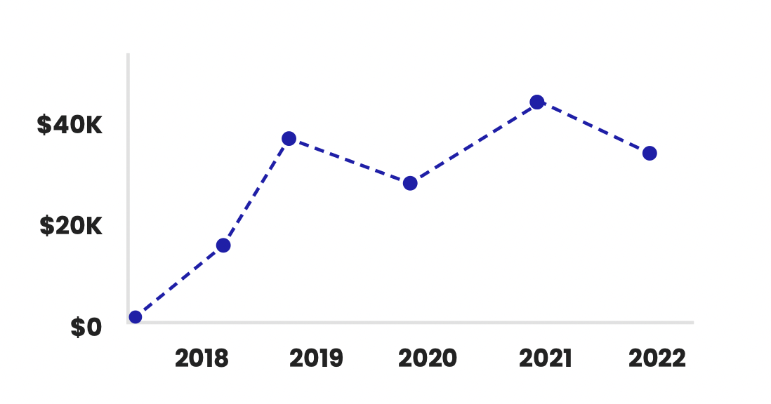
2. Line graph
A line graph plots values across time and connects points to show movement. For finance teams, it's the go-to format for trend analysis because it quickly shows direction, volatility, seasonality, and unusual spikes.
Where line graphs work best in finance
- Tracking revenue, gross margin, EBITDA, or CAC over time
- Monitoring daily/weekly cash balances and cash flow patterns
- Showing budget variance trends across months or quarters
- Visualizing market data and stock charts (price movement over time)
How to make time-series data readable
- Pick the right frequency: daily for trading/cash monitoring, monthly for management reporting, quarterly for board-level summaries
- Use clear time anchors (month labels, quarter markers) so the reader can orient quickly
- If you include projections, differentiate them (dotted line) and label assumptions
- Avoid clutter: one to three lines is ideal; beyond that, use small multiples or split charts
When to use a line graph vs. other charts
- Use a line graph when you want the reader to understand change over time (trend direction and rate of change)
- Use a bar chart when the focus is comparing discrete categories (departments, products)
- Use an area chart when you want to emphasize magnitude (but be cautious: it can hide small changes)
Best for: Visualizing financial trends, time-series data, seasonality, and stock price movement. Allows you to see increases, decreases, and anomalies over time. Great for illustrating trends and time-series data.
3. Pie chart
A pie chart divides data into proportional slices of a circular "pie" to represent percentages or proportions of a whole.
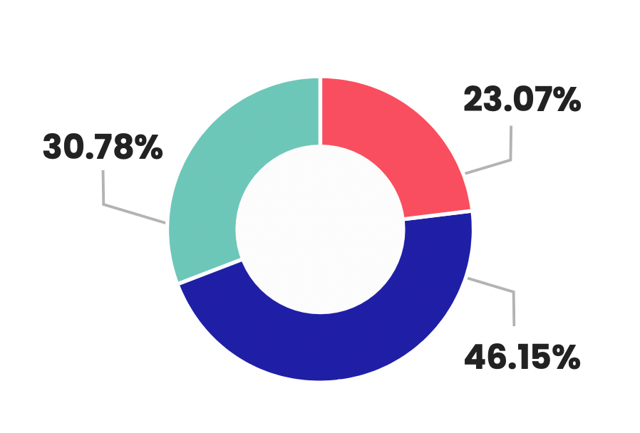
Best for: Pie charts are useful for depicting changes over time. They're also widely used to show the breakdown of a whole into parts, like revenue by region, expense categories, or allocation of a budget. Helps see the size of components and their relationship to the whole.
4. Scatter plot
A scatter plot positions data points on a graph based on two variable scales. It reveals relationships and correlations between the variables.
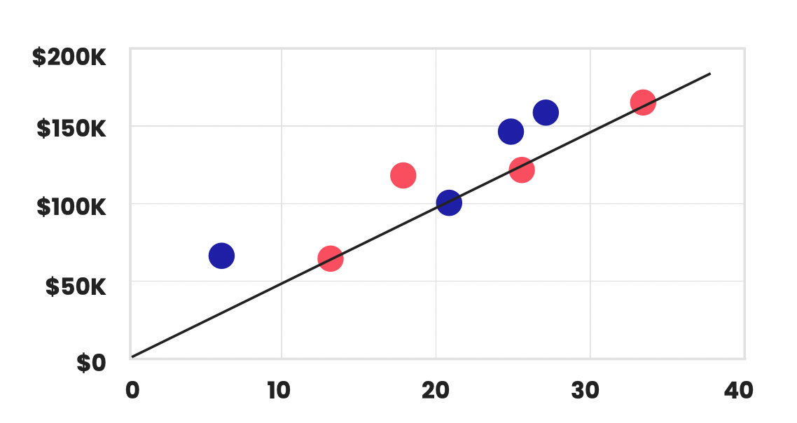
Best for: Comparing two financial metrics to see if they're correlated, like sales vs. marketing expenses. Allows you to identify patterns and trends between the variables. Best for displaying the relationship between two variables.
5. Heat map
A heat map uses color coding to represent values and the density of data points in a table or matrix format.
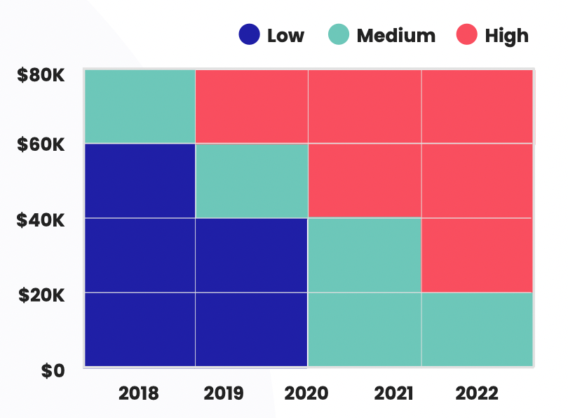
Best for: Visualizing correlations between large datasets with many variables. Useful for finding patterns in financial data like factor correlations. Excellent for visualizing data density or concentrations.
6. Area chart
An area chart displays quantitative data similarly to a line chart, but the area below the line is colored to represent volume or magnitude.
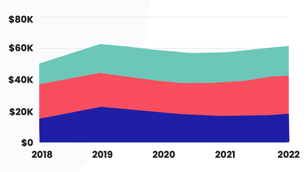
Best for: Highlighting trends and drawing attention to the overall magnitude of change over time. Can be useful for financial metrics like revenue and profit growth.
7. Stacked bar chart
A stacked bar chart segments the bars into colored sections to show how different components make up a whole.
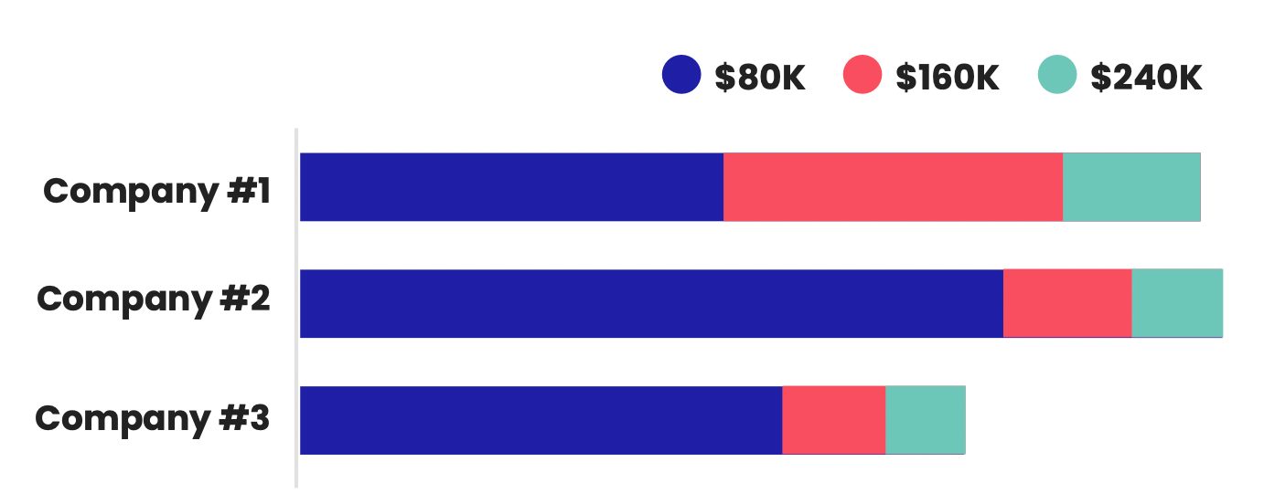
Best for: Breaking down financial data across multiple sub-categories like revenue by product, region and showing the composition of the total. Effective for showing the composition of categories or the distribution of data across multiple groups.
8. Bubble chart
A bubble chart displays data points as circles with varying sizes based on a third variable. Often used along x and y axes.
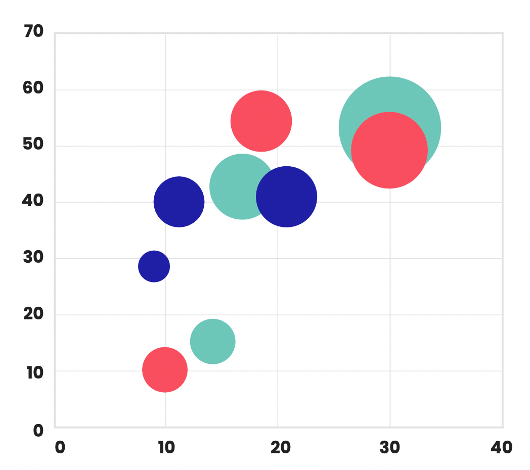
Best for: Simultaneously visualizing three variables, like market size, growth rate and investment amount when analyzing expansion opportunities. Ideal for representing three or more variables simultaneously, while showing the relationship and differences between them.
9. Waterfall chart
A waterfall chart shows how positive and negative values contribute to a final total through cascading levels.
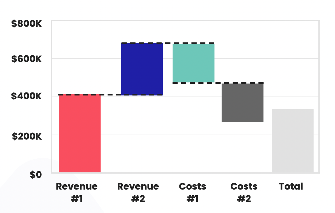
Best for: Understanding the incremental buildup or breakdown of a financial metric like analyzing sources of net income changes from one period to the next. Excellent for visualizing the cumulative effect of sequentially introduced positive or negative values, typically used for understanding the incremental contribution of different factors to a final value.
10. Box and whisker plot
This chart plots statistical distributions by showing the median, quartiles, extremes and outliers of the dataset.
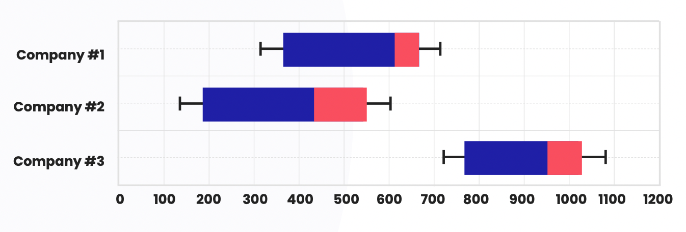
Best for: Understanding the distribution, spread and skew of financial data like revenue per customer. Allows you to see central tendencies and anomalies. Ideal for displaying the distribution of data, highlighting outliers, and showcasing the central tendency and dispersion of a dataset.
11. Radar chart
A radar chart has multiple axes projecting from a center point to display data for multiple variables. Also called a spider chart.
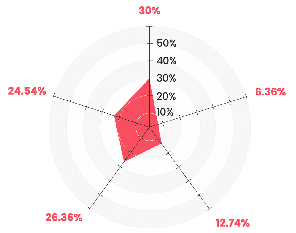
Best for: Comparing multiple metrics like financial KPIs across business units or departments to see performance patterns and profiles. Useful for comparing multiple quantitative variables, showcasing the performance or profile of different entities across various attributes.
A few more advanced financial charts and graphs to consider
Now, we’re going to look at some slightly more advanced techniques for data visualization, including the use of a financial planning graph.
These techniques help reveal hidden patterns, trends, and relationships in the data, making it easier to make data-driven decisions. They’re best suited for individuals with a strong understanding of data analysis and visual design principles.
Below, we explore some of these advanced graphs and charts:
12. Treemaps
Treemaps are a space-filling visualization technique that uses nested rectangles to represent hierarchical data.
They’re useful for displaying financial data with multiple levels, such as the breakdown of a company’s revenue by product category and subcategory.
The difficulty in creating treemaps involves selecting appropriate nesting and color-coding schemes to ensure clarity.
When to use
- Revenue breakdown by division → product category → SKU
- Spend analysis by department → vendor → cost type
- Portfolio exposure by sector → industry → holding
Watch outs
- Poor hierarchy choices create confusing blocks
- Too many tiny rectangles become unreadable—aggregate small items into "Other"
13. Sankey diagrams
Sankey diagrams are flow diagrams that show the flow of data or resources between nodes, using the thickness of the connecting lines to represent the flow’s magnitude.
They’re useful for visualizing financial flows, such as the movement of funds between accounts or the distribution of investments in a portfolio.
The challenge in creating Sankey diagrams comes from managing the layout and line thicknesses to accurately represent the data.
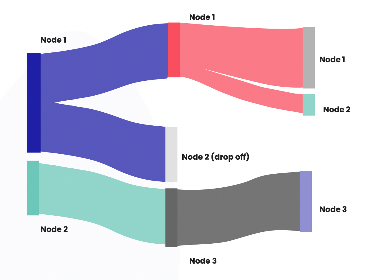
When to use
- Cash flow or funds flow (sources → uses)
- Cost allocation pathways across teams or products
- Customer revenue flow across channels or segments
Watch outs
- Too many nodes makes it spaghetti—limit to key pathways
- Requires clean "from → to → value" structured data
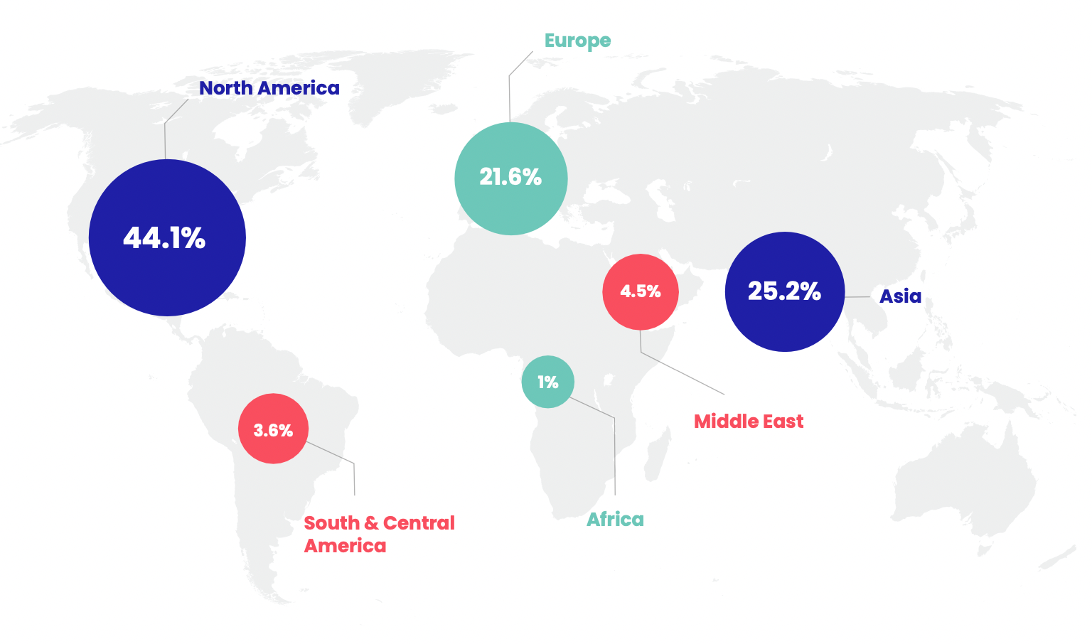
14. Choropleth maps
Choropleth maps use color gradients to represent data values across geographical regions, such as countries or states.
They’re ideal for visualizing regional financial data like GDP growth, poverty rates, or market penetration.
The difficulty in creating choropleth maps lies in selecting the right color scheme and ensuring the data is accurately represented geographically.
When to use
- Regional sales performance and growth
- Market penetration or customer concentration by territory
- Credit risk or delinquency rates by region
Watch outs
- Absolute values can mislead on maps—consider normalizing (per capita, per store)
- Choose color scales that remain readable for color-vision deficiencies
15. Network graphs
Network graphs display relationships between entities through nodes and edges. They’re ideal for visualizing connections in large datasets, such as relationships between companies, investors, or assets.
The difficulty in creating network graphs comes from dealing with large amounts of data and ensuring the visualization remains readable.
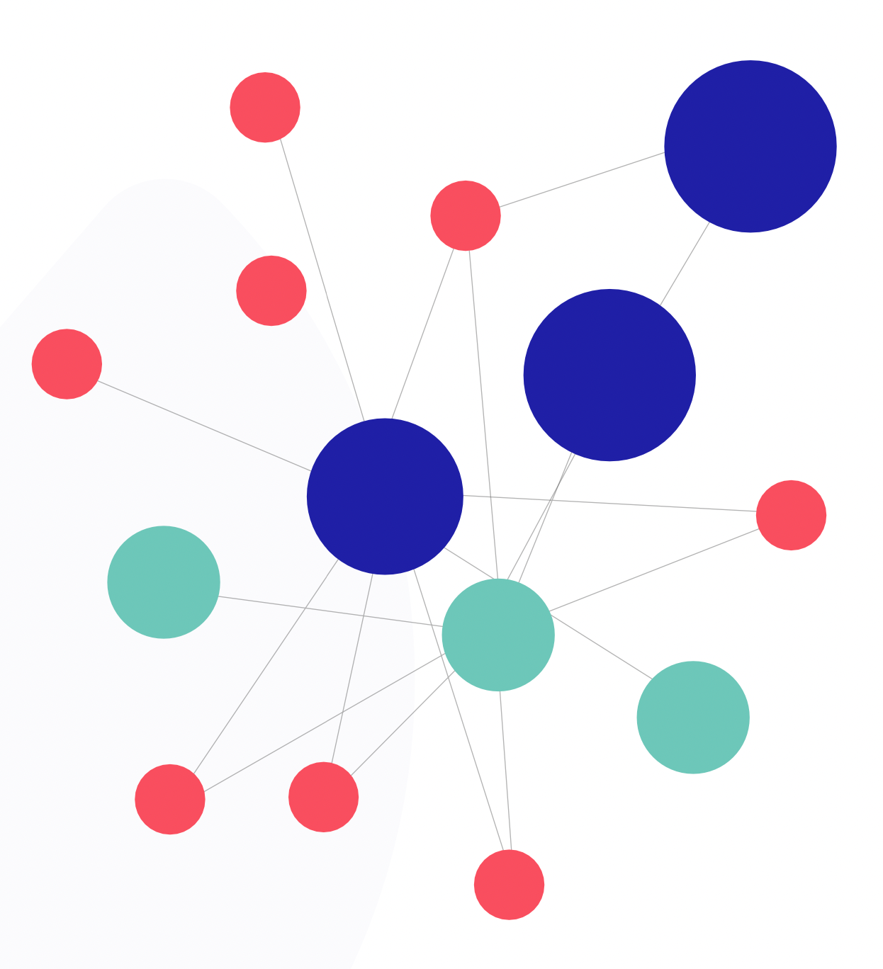
When to use
- Comparing financial ratios across companies (margin, leverage, liquidity, growth)
- Screening investments using multiple criteria at once
- Multi-KPI performance analysis across business units
Watch outs
- High clutter with many entities; use filtering, highlighting, and sampling
- Requires careful axis ordering to avoid misleading patterns
16. Parallel coordinates
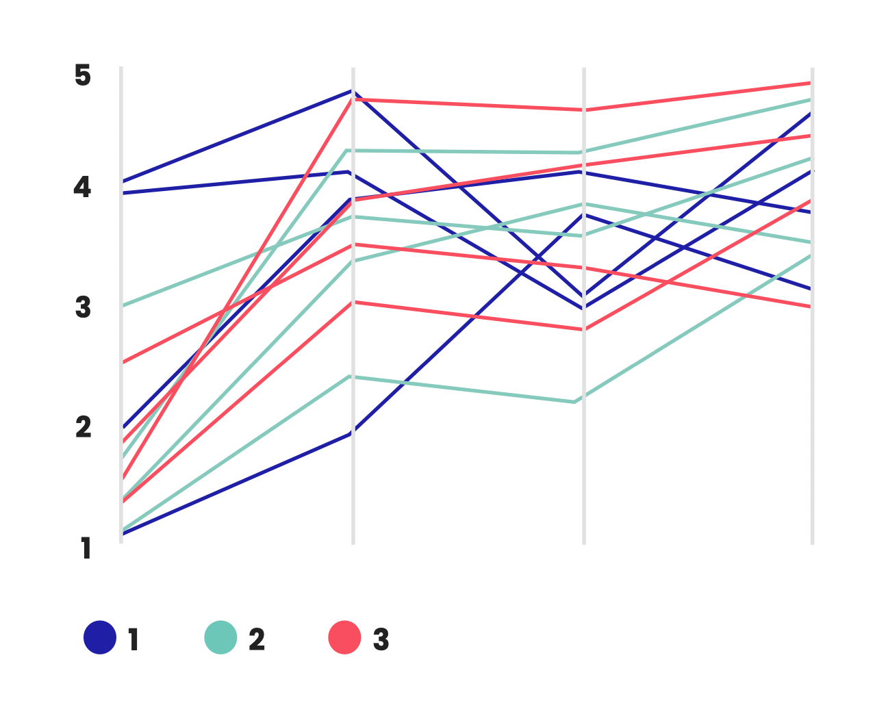
Parallel coordinates plot multivariate data on parallel axes, which allows for the comparison of multiple dimensions simultaneously.
This technique is useful for visualizing relationships between different financial variables or analyzing the performance of multiple assets. The challenge lies in managing axis spacing, scaling, and labeling, while maintaining readability.
 Sabrinthia Donnelly
How to choose the right finance chart or graph for your needs
Ever stared at a spreadsheet full of financial data and wondered how to turn it into something clear and impactful? I think we've all been there.
Thankfully, there are some best practices you can follow to help you pick the perfect option for your needs.
Step 1: Know your goal
You need to understand what you want the chart or graph to convey to your audience.
Are you highlighting trends over time, like stock prices or monthly sales? Line and area charts are great for that. They'll showcase the journey of your data and accurately visualize the direction and magnitude of changes.
Need to compare different categories, like expenses or budget allocations? Bar charts are your go-to. They'll let you see side-by-side how things measure up.
Step 2: Keep it simple
Think about your audience. If they're new to financial charts, stick to the classics: line, bar, and pie. These are universally understood and will get your message across.
For example, classic charts like bar charts are universally understood and can convey your message perfectly.
It's also important to avoid overcomplicating things. Simple charts with clear labels and well-defined colors ensure your data is accessible to everyone.
Step 3: Complexity matters
If you're dealing with a lot of data or want to show relationships between variables, you might need a more specialized chart like a scatter plot.
If you want to branch into more advanced options, you could try a heatmap, which is great for showing the intensity of data points within a dataset, such as expense concentrations across different categories and periods.
But for most everyday financial needs, the basic options will do just fine.
Step 4: Match the charts to your audience/setting
Executive updates
- Prefer simple standards: bar, line, waterfall
- One message per chart. Label the takeaway directly on the visual
Finance/analyst audiences
- More tolerance for density: scatter plots, heat maps, advanced charts
- Include definitions (e.g., "gross margin %") and methodology notes where needed
External/public reporting
- Prioritize accessibility (colorblind-safe palettes, clear captions, sources)
- Avoid niche chart types unless you can explain them quickly
A quick data prep checklist (before you build the chart)
- Confirm units ($, %, bps) and time period definitions (MTD/QTD/YTD)
- Use consistent time intervals (don't mix weekly and monthly without explanation)
- Normalize where needed (per customer, per store, per capita) to avoid misleading comparisons
- Handle missing data explicitly (gap, interpolation, or "N/A")
- Use consistent category naming (avoid duplicates like "Ops" vs "Operations")
FAQs: Financial charts and graphs
How do you decide which graph to use?
The choice of graph depends on the data type, the information you want to convey, and the audience's familiarity with the chart type. It's essential to choose a graph that best represents the data's story.
What are the different types of financial charts?
Common financial charts include line charts, bar/column charts, pie charts, waterfall charts, scatter plots, candlestick charts (for stock prices), and area charts, among others.
What is the best chart for financials?
There's no one-size-fits-all answer. The best chart for financials depends on the specific data and the intended message. For stock price movements, candlestick charts are popular, while for budgeting, bar or column charts might be preferred.
Why are graphs important in finance?
Graphs provide a clear, visual way to quickly grasp complex financial data, uncover insights, and facilitate decision-making. They help in identifying patterns, trends, and anomalies that might be missed in tabular data.
What is the best graph to show money?
Bar charts are ideal for showing money amounts, such as revenue, expenses, or profits, across different categories. They provide a clear comparison and are easy to read.
What chart is best for budgeting?
Pie charts are effective for showing budget allocations. They visually represent how the budget is divided among different categories, making it easy to see proportions.
What is the best chart to show year-over-year growth?
Line charts are great for illustrating year-over-year growth. They show trends over multiple years, making it easy to identify patterns and growth rates.
Which chart is most ideal for showing trends over time?
Line charts are the most suitable for showing trends over time. They clearly demonstrate changes and trends over a continuous period, whether it’s months, quarters, or years.
Take our Business Partnering & Storytelling: Certified course
Unlock the power of storytelling and transform your role in finance with our Business Partnering & Storytelling course. Learn how to make data speak and influence strategic decisions that matter.
This course gives you immediate access to five hours of dynamic video content, presentation slides, and hands-on resources. You’ll get practical insights from Christian Wattig, FP&A expert, on how to deliver impactful business insights and foster meaningful relationships that drive organizational success.
Enhance your communication and business partnering skills today. Sign up and start your journey now!


Become an FA Insider
Thank you for subscribing
Get exclusive insights, frameworks, and strategies from finance leaders driving real business impact.
An email has been successfully sent to confirm your subscription.
 Follow us on LinkedIn