If you want to extract meaningful insights from data, understanding the key principles of financial data visualization is crucial.
In this article, we'll delve into these principles, revealing how they're reshaping the finance industry. We'll also discuss data storytelling in finance and offer some best practice tips from the experts.
Table of contents:
- What is data visualization?
- What is data storytelling?
- Data storytelling vs data visualization
- Why should you care about data storytelling?
- Key principles of data visualization in finance
What is data visualization?
Data visualization is a visual display of information or data. Rather than staring at spreadsheets or numbers, you can use colorful charts, graphs, and other visuals to help make sense of complex data.
The goal of data visualization is to make the information more accessible, understandable, and interesting. It helps you see patterns and trends that might not be immediately apparent when you’re looking at rows and columns of numbers. With data visualization, you can quickly identify what’s working, what’s not, and where there might be room for improvement.
Effective data visualization requires careful consideration of the financial data presented, the target audience, and the desired outcomes.
What is data storytelling?
Data storytelling is the art of transforming raw, numerical data into visually compelling narratives that captivate your audience. It combines the power of data analysis with the impact of storytelling to present financial information in a way that’s clear, engaging, and actionable.
By using a variety of visualization tools – such as bar charts, scatter plots, timelines, graphs, heat maps, and more – you can paint a vivid picture of your data, making it easier for non-finance professionals to grasp and act on your insights.

“It’s predicted that around 120 zettabytes (ZB) of data will be produced in 2023; in 2010, it was 2ZB! Businesses have more data than ever available to them but there is no point in producing and storing it if it is not used to gain insights and drive decisions. That’s where Data Visualisation comes into play. It is the art of bringing together large, sometimes disparate datasets and presenting them in a digestible form.
“If done right, it can be a perfect balance of quantitative and qualitative analysis, i.e. giving key results and KPIs but with a visual representation of the reasons driving these outcomes. It helps with absorbing information about data quickly.
"As data volume inevitably increases, visualization manages influxes of new information and makes it easy to find trends, understand requirements, and see correlations between business conditions that could otherwise go unnoticed.
“Among its many benefits, it can give leaders the ability to manage by exception, dashboards, and visuals can direct them to areas that most need their time and resources e.g. highlighting risk and possible mitigation.” - Liam Boyle, Data Analyst at Future Beauty Labs
Data storytelling vs data visualization: What are the main differences?
Data visualization
Data visualization for financial data involves presenting information in a pictorial or graphical format such as charts, graphs, and maps, so that decision-makers can see patterns, trends, and insights more easily.
Use in finance: Often used in financial analysis for pattern recognition, spotting market trends, risk management, and investment decision-making. Dashboards with real-time KPIs and heat maps of asset performance are examples of data visualization in finance.
Pros:
- Simplifies complex datasets.
- Quick and intuitive understanding of data.
- Supports decision-making processes.
Cons:
- Lacks context and narrative - may not fully explain 'why' and 'how'.
- Not always effective for detailed analysis or complex datasets.
Data storytelling
Definition: Data storytelling involves combining data, visuals, and narrative to convey meaningful and impactful insights from data. It not only presents data but also provides a story to give context, making the data more relatable and understandable.
Use in finance: Can be used in financial presentations to shareholders or management, explaining complex fiscal scenarios, narrating the financial health of a company, or communicating strategies for growth or cost-cutting.
Pros:
- Enhances audience engagement by providing context and narrative.
- Explains complex ideas in a digestible way.
- Can guide the audience to specific conclusions or actions.
Cons:
- More time-consuming to create.
- Can introduce bias based on the narrative chosen.

Why should you care about data storytelling?
In the fast-paced world of finance, it’s essential to communicate complex data effectively and efficiently.
But why should you, as a finance expert, care about telling stories with data?
Here are five key reasons:
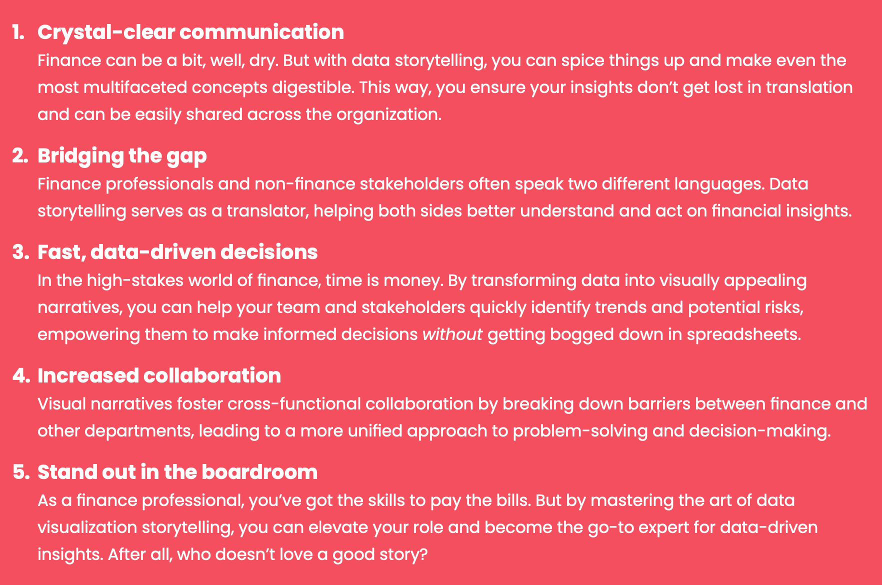
Key principles of data visualization in finance
We asked Soufyan Hamid, Finance Presentations Coach at SouFBP, to share some of the key data storytelling and visualization principles in finance, and here’s what he had to say:
The question you have to ask yourself is whether data visualization is necessary. Many times, explaining the issue is sufficient.
But most of the time in finance, they’ll be needed and for that, the key principles are:
1. Simplicity
If a chart is more complex than a table, it’s not doing the job of giving the message and supporting your speech.
2. Accuracy
When I say accuracy, I am not saying that it must show all the details but it must not mislead the audience. Many times, we see charts where we play with the axis and give the impression that a bar is far longer than another but it’s not the case.
3. Tailored
In the age of business intelligence (BI) and dashboard solutions, efficiency is taking the lead. But the thing is when used in a presentation or a report, you have to tailor the colors, the labels, and the explanations to support your point. If you give a standard chart, you don’t do the job of analyzing it for the reader.
Continuing from Soufyan’s insights, let's delve into a few more essential principles of financial data visualization:
4. Consistency
Consistency in the use of colors, symbols, and units helps in interpreting visualizations easily. Stick to a particular color code or symbols throughout your data to avoid any confusion.
5. Context
Always provide context to your visual data. For instance, if you're showing revenue growth, include information about the market trends or competitor performance during the same period. This helps the audience understand the significance of the data.
6. Interactivity
With advanced data visualization tools, you can make your visuals interactive. This allows your audience to explore data at their own pace, particularly helpful when dealing with complex or extensive data sets.
7. Balance
Striking a balance between simplicity and detail is crucial. While you want your visual to be simple enough to understand, it should also carry sufficient details to convey the complete story.
8. Data integrity
Above all, ensure your visualizations maintain data integrity. Misrepresenting data can harm your credibility and mislead your audience. Always double-check your sources and ensure your visualizations accurately represent the underlying data.
Remember, visualizing financial data is not merely about creating graphs or charts. It's about presenting data in a meaningful, understandable, and accurate way that supports your narrative and facilitates decision-making. Following these principles can enhance the effectiveness of your data visualization in finance.
FAQs: Principles of data visualization
Is data visualization always necessary in finance?
Not always. Sometimes, a well-explained narrative can convey the point without visualization. However, for complex data or trends, data visualization can aid in better comprehension.
How can I choose between data storytelling and data visualization?
It depends on your goal and audience. Data storytelling is useful when you want to engage the audience with a compelling narrative, while data visualization is excellent for quick, intuitive understanding.
Are there any specific tools I should use for financial data visualization?
There are various tools available such as Tableau, PowerBI, and Excel. The choice depends on your specific requirements, the complexity of data, and your comfort with the tool.
How can I ensure my visualizations are easily understood?
Stick to simplicity and clarity. Use consistent colors and symbols, provide context, and avoid overloading your visuals with too much data.
How can data visualization support decision-making in finance?
By providing visual representations of complex data, visualizations can help identify patterns, trends, and insights that support strategic decision-making in finance.
Download the Storytelling with Data Visualization Playbook
Tired of presenting financial data that falls flat? Frustrated that your insights are lost in a sea of numbers and charts? Worry no more! We've created the ultimate playbook to help you transform your financial data into captivating, persuasive stories.
Discover the essential components of a powerful data narrative and learn how to weave them together to create a story that resonates with your audience.
What's Inside?
✅ A step-by-step guide to crafting compelling data stories
✅ Financial data preparation and cleaning tips
✅ Expert tips on selecting the right graphs and charts
✅ Best practices for engaging presentations that inspire action
✅ How to build a persuasive argument with financial data


Finance alliance insider
Thank you for subscribing
Level up your finance alliance career & network with finance alliance experts.
An email has been successfully sent to confirm your subscription.
 Follow us on LinkedIn