Color is an incredibly powerful tool in data storytelling, capable of evoking emotions, drawing attention, and communicating complex information quickly and effectively.
When used right, color can help viewers differentiate between different data points and highlight key insights. By using different hues, shades, and tones, you can create visual hierarchies that make it easier for viewers to understand data at a glance.
For example, using bright colors to highlight important data points can help draw the viewer’s attention to critical information, while more muted colors can help balance the composition and make the visualization easier to read.
- Color selection: Which colors work best?
- The psychology of color in data visualizations
- Colors and emotions
- 7 tips for using color in your data visualizations
Color selection: Which colors work best?
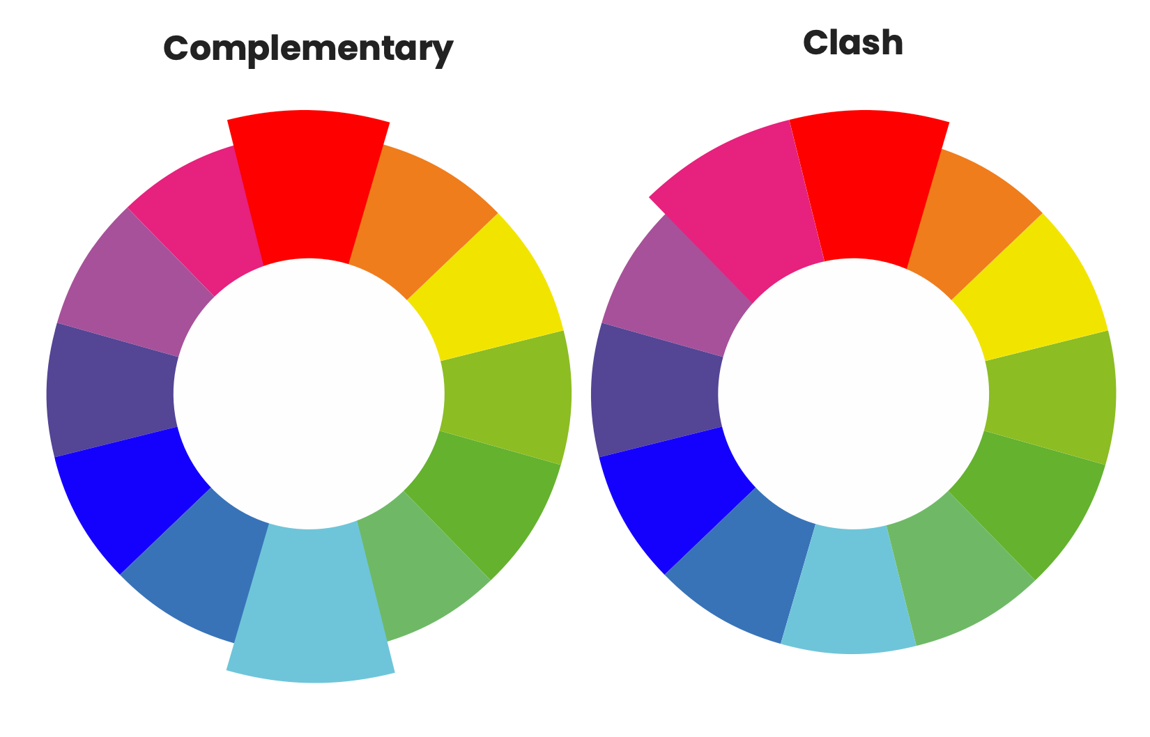
When it comes to color selection, it’s essential to choose colors that work well together and don’t clash. Color combinations on opposite sides of the color wheel complement each other, such as blue and orange, which tend to work well together and can create an appealing visual contrast.
Others, like red and green or purple and yellow, can clash and make it difficult for viewers to distinguish between different data points.
Here’s an example of how some colors work well together and others tend to clash:
The psychology of color in data visualizations
Good data visualization isn’t just about choosing colors that look good together – it’s also about considering the cultural and emotional associations that different colors can evoke.
For example, red is often associated with danger or excitement, while blue evokes a sense of trustworthiness and stability. Understanding these associations can help you reinforce your message and create a more impactful visualization.
Colors and emotions:
Red: Often associated with excitement, passion, and danger, red can be a good choice for highlighting important information or drawing attention to key insights. However, overusing red can be overwhelming, so it’s best used sparingly.
Blue: Tends to evoke feelings of trustworthiness, stability, and calmness, blue is a versatile color that can work well in a variety of data visuals. It’s also easy on the eyes, making it a good choice for longer presentations or reports.
Green: Commonly linked with growth, prosperity, and balance, green is a good choice for financial data visualizations. It can also be calming, making it a good choice for visuals or presentations that require a lot of detail.
Yellow: Universally tied with happiness, optimism, and energy, yellow is perfect for highlighting important data points.
Orange: Usually connected with enthusiasm, creativity, and warmth, orange is great for increasing energy or excitement. It’s also ideal for highlighting key insights.
Purple: Traditionally paired with luxury, creativity, and sophistication, purple gives the impression of elegance. However, it’s another color that can be overwhelming if used too much, so just make sure to use it sparingly.
Gray: Generally tied to neutrality, formality, and professionalism, gray can help create a balanced and professional-looking visualization. It can also help highlight other colors and create contrast.
7 tips for using color in your data visualizations
1. Highlight key insights
Use color to draw attention to important data points or trends that you want your audience to focus on. This will help you make your message more impactful and memorable.
2. Contrast is key
Choose contrasting colors to differentiate between different categories or segments in your visualization. This will help ensure your audience can quickly and easily understand the information you’re presenting.
3. Consider accessibility
Keep in mind that not all viewers may be able to see colors the same way. Consider using color-blind-friendly palettes to ensure that everyone can access the information in your visualization.
4. Keep it simple
Limit the number of colors you use to avoid overwhelming your audience. Stick to a few key colors that work well together and complement your data.
5. Purposeful color choices
Be purposeful with your color choices. Consider the cultural and emotional associations of different colors when selecting them for your visualization.
6. Consistent color scheme
Use a consistent color scheme throughout your visualization to create a cohesive and professional look.
7. Create a visual hierarchy
Use color to create visual hierarchies that make it easy for viewers to understand the data at a glance. For example, you could use a bright color to highlight a key data point and a more muted color for supporting data.
“You can use generally accepted colors that lead to a “normal” emotional response like green for positive or red for negative.
“Another important element that I always enforce when training teams is to use the company’s color palette and not the standard Excel colors.
“It will show your business implication, people will recognize them and feel more confident and it will be standardized.
“A last important point regarding colors is to make sure to cover for color blind people and replace green by blue and red by orange/yellow.” - Soufyan Hamid, Finance Presentations Coach at SouFBP
Discover the essential components of storytelling with data visualization
Are you tired of presenting financial data that falls flat? Frustrated that your insights are lost in a sea of numbers and charts?
Worry no more! We've created the ultimate playbook to help you transform your financial data into captivating, persuasive stories.


Finance alliance insider
Thank you for subscribing
Level up your finance alliance career & network with finance alliance experts.
An email has been successfully sent to confirm your subscription.
 Follow us on LinkedIn