The use of management dashboards to monitor management KPIs, metrics, and other essential data points allows you to make rapid, data-based decisions based on up-to-date information about the business.
A management dashboard provides a comprehensive snapshot of the company’s performance. This is critical since it condenses massive amounts of information into a one-page summary of invaluable insights into the health of your company.
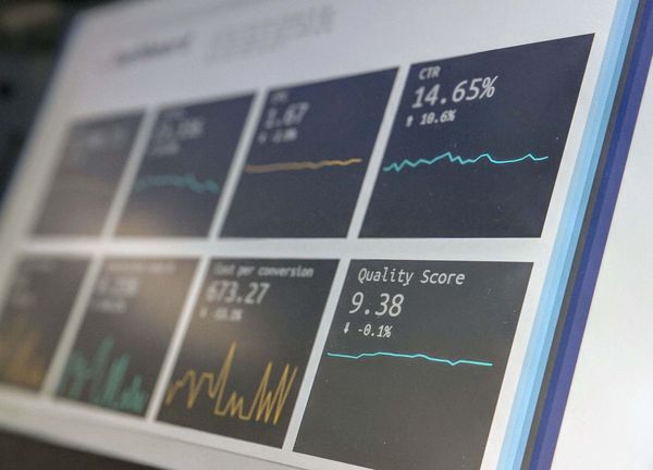
In turn, a management dashboard can help with executive decision-making. Plus, you can access the most relevant information instantly. The data is represented visually using tables, line charts, bar charts, sparklines, maps, gauges, etc. This visual format for recording and analyzing data makes it easier to read while allowing you to view all the information at a glance.
Finance professionals are often required to create management dashboards to track KPIs, goals, metrics, and so on. Since management dashboards are easy-to-read, they're also easy to share. So, you can bet that the CFO and other members of the C-Suite will want to cast their eye on your management dashboards, which is why it's important that you understand the various types of business dashboards, how to use them, and how to create them from scratch.
In this article, I'll teach you all of the above, plus the following:
- Different types of business dashboards
- Top advantages of using management dashboards
- How to design an effective dashboard
Types of business dashboards
There are three types of business dashboards:
- Operational dashboards which emphasize monitoring. These reflect the business processes and help monitor KPIs.
- Strategic dashboards which emphasize management. They reflect the end status of a KPI or metric for a set period.
- Tactical dashboards that highlight the analysis. They help you identify trends and track how metrics have changed.
Finance dashboard
Your finance dashboard should offer a summary and interpretation of key aspects such as profit, loss, and cash management. This will be the most important dashboard for finance professionals.
However, it's worth knowing about other types of management dashboards that are used within the business. These may include the following examples...
Sales and Marketing dashboard
Your marketing dashboard should provide insight into how successful the company’s marketing efforts are at generating sales, attracting new customers, and retaining existing ones. You should be able to see where people are getting ‘stuck’ in your sales funnel or pipeline.
Risk management dashboard
Your operation and safety dashboard should help you and your team manage and prevent risk. It could include training and awareness, incident management, claims, compliance, risks for assets and projects, and hazard identification.
HR dashboard
Your HR dashboard should provide reports on internal metrics such as employee satisfaction as well as external metrics such as your company’s success rates for recruitment. Depending on the size of the organization, it could also be used to track turnover and retention rates.

The benefits of using management dashboards
Instant access to core business metrics
Users across your organization will be able to access core business metrics.
Consolidate data from across multiple analytic services
The management dashboard consolidates data from many data points in an organization to provide one reporting interface. It will save time and effort typically spent on compiling reports, signing into different analytic services, and then sharing the data with everyone in the company.
Provide real-time updates
Since changes in data or values are reflected in dashboards, you can identify fluctuations in crucial business metrics when they happen rather than having to wait for daily or weekly reports.
Align departments
Dashboards can provide metrics that are relevant to each department.
Allow root cause analysis
If you spot unusual trends in your summary reports, you can drill down to find their root cause.
Communicate and manage strategy
Dashboards can be used as agents to boost organizational change.
How to design the best dashboard
A well-designed dashboard will help improve your company’s productivity and save time. But a badly-designed dashboard will confuse users and challenging to share. It needs to be easy to use and to report the most meaningful data and insights.
That’s why you must select the right metrics to display. Avoid the temptation to add as many metrics as you can. If you need to monitor lots of metrics, use dashboard tabs.
Keep the design simple to make it easier for people to read and digest the information. Avoid using too many colors or fonts or different graphics. Group data in a way that’s relevant and which provides context.
To encourage as broad a range of users as possible, make the dashboard interactive with options to filter and drill down.
Decide the reporting frequency based on the type of dashboard you’re using. For example, structure operational dashboards so they provide daily reports and set up strategic dashboards to give a monthly or quarterly report.
Want to discuss finance dashboards with a group of leading finance experts? Join the Finance Alliance Slack Community today!


Finance alliance insider
Thank you for subscribing
Level up your finance alliance career & network with finance alliance experts.
An email has been successfully sent to confirm your subscription.
 Follow us on LinkedIn